Introduction
You love your white countertops. But you’re worried about your kitchen looking boring or old. The all-white kitchen is falling out of style in 2026. But white countertops are still a great choice. They are bright, clean, and work with almost anything. The problem is picking the right cabinet color. Get it wrong, and your kitchen feels cold or mismatched. Get it right, and you have a space that feels fresh for years.
In this guide, you will learn 15 specific kitchen cabinet colors for white countertops. We will show you what designers are using in 2026. You will learn about undertones, finishes, and hardware. No fluff. Just actionable ideas to help you avoid a costly mistake.
Why Your Cabinet Color Choice Matters More in 2026
Here is the truth. The stark, all-white kitchen is done. It looked good in 2015. But in 2026, it feels sterile and basic. Designers have moved on. A recent survey found that 96% of designers now favor warm neutrals over cool grays and stark whites.
White countertops are not the problem. They are a strong base. Quartz, marble, or solid surface – white counters reflect light and make a room feel bigger. The issue is pairing them with white cabinets. That creates a lab, not a home.
The new rule is contrast and warmth. You need cabinet colors that add depth and personality. Think warm greiges, soft greens, and rich woods. These colors make white countertops pop instead of disappear.
And here is why this matters to you. A professional kitchen cabinet paint job costs between $3,000 and $8,000 for a mid-size kitchen in 2026. That is real money. You do not want to repaint in two years because your kitchen looks dated.
So let’s fix that. Below are 15 kitchen cabinet colors that work beautifully with white countertops in 2026.
15 Kitchen Cabinet Colors for White Countertops (2026 Edition)
We grouped these colors into five families. Each family creates a different mood. Pick the one that fits your home.
Warm Neutrals (The 2026 Sweet Spot)
These are the safest and most popular choices. They add warmth without being bold.
1. Creamy Off White (Sherwin-Williams Alabaster)

This is not pure white. It is soft and warm like natural linen. It works with white countertops because it adds a subtle contrast. Your countertops will look brighter next to these cabinets. The best finish is satin or eggshell. This color creates a calm and welcoming mood. Pair it with brushed brass or oil-rubbed bronze hardware.
2. Warm Greige (Benjamin Moore Revere Pewter)

Greige is gray plus beige. It is the perfect bridge between cool and warm. This color softens the starkness of bright white counters. It also hides fingerprints better than white. Use a matte or satin finish. The mood is sophisticated but cozy. Matte black or aged nickel hardware works best.
3. Buttery Yellow (Farrow & Ball Sudbury Yellow)

This is an emerging trend for 2026. Not bright school bus yellow. A soft, muted yellow like butter. It adds cheerfulness without screaming. White countertops keep it from feeling too heavy. A satin finish is ideal. The mood is happy and energetic. Polished brass or white ceramic hardware pairs nicely.
Cool & Calm (For a Spa Vibe)
These colors work well in kitchens that get a lot of sunlight. They create a relaxing feel.
4. Sage Green (Behr Sage Green)

Green is the top nature inspired color for 2026. Sage green is muted and earthy. It pairs perfectly with white counters because it provides a gentle contrast. Your kitchen will feel like a peaceful garden. Choose a matte or eggshell finish. Brushed nickel or black hardware complements it well.
5. Soft Blue (Sherwin-Williams Rainwashed)

Think of a clear sky after rain. This soft blue is light and airy. White countertops reflect the blue, making the whole room feel fresh. It is a great choice for small kitchens. A satin finish works best. The mood is serene and clean. Chrome or polished nickel hardware is a good match.
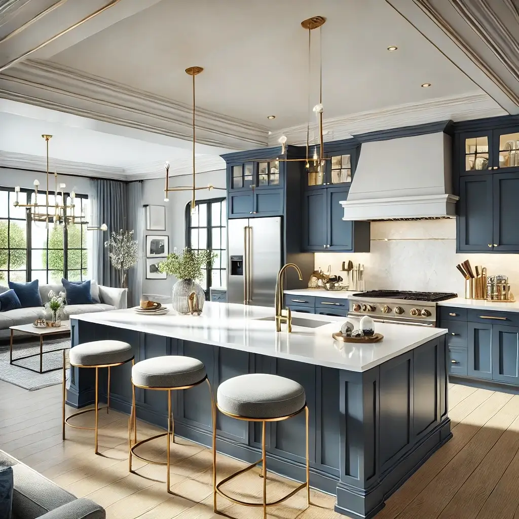
6. Dusty Blue (Benjamin Moore Wythe Blue)

Dusty blue has a gray undertone. It is moodier than soft blue but still calming. This color adds depth without being dark. White counters provide a bright anchor so the room does not feel gloomy. Use a matte finish. The mood is quiet and thoughtful. Brass or aged copper hardware adds character.
Deep & Dramatic (For Bold Personalities)
These colors make a statement. Use them on lower cabinets or an island. Do not use them on every cabinet in a small kitchen.
7. Navy Blue (Farrow & Ball Hague Blue)
Navy is a timeless classic. It provides stunning high contrast with white countertops. The white pops against the dark blue. This works best in large kitchens with good natural light. A satin or semi-gloss finish is best. The mood is confident and elegant. Polished brass or gold hardware looks stunning.
8. Charcoal Gray (Sherwin-Williams Peppercorn)
Charcoal is a sophisticated alternative to black. It is deep but not harsh. White countertops look crisp next to it. This color hides stains and wear very well. Use a matte finish. The mood is modern and strong. Black or brushed stainless steel hardware works well.
9. Espresso (Dark Wood Stain)
Not all cabinets are painted. A rich espresso stain on wood grain adds warmth and depth. The natural wood texture adds interest that paint cannot match. White countertops balance the darkness. A satin clear coat finish is ideal. The mood is rich and grounded. Matte black or oil-rubbed bronze hardware complements it.
Earthy & Natural (The Organic Look)
These colors bring the outdoors in. They work great with white countertops because they feel honest and unfussy.
10. Natural Wood (Light Oak or Maple)

Light wood is back. Not the orange oak of the 1990s. Modern light oak is pale and natural. It adds warmth without being yellow. White countertops look fresh next to the wood grain. Use a matte clear coat finish. The mood is organic and warm. Black or leather pulls are a great choice.
11. Terracotta (Sherwin-Williams Cavern Clay)

Terracotta is a warm, earthy reddish brown. It adds rustic charm. This is a bold choice, so use it on one wall or an island. White countertops cool down the warmth and create balance. A matte finish works best. The mood is rustic and inviting. Aged brass or black iron hardware fits perfectly.
12. Warm Taupe (Benjamin Moore Shaker Beige)

Taupe is brown with gray undertones. It is a perfect neutral for 2026. Warmer than greige but not as brown as traditional beige. White countertops brighten it up. Use an eggshell or satin finish. The mood is stable and comfortable. Brushed nickel or bronze hardware pairs well.
Two-Tone & Accents (The Best of Both Worlds)
Why pick one color when you can pick two? This is a rising trend for 2026.
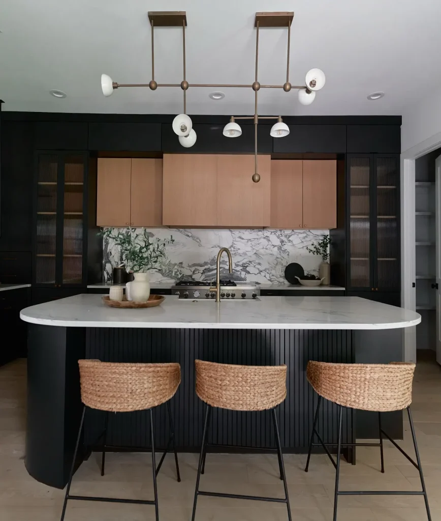
13. Two-Tone (Light Uppers, Dark Lowers)

This adds visual interest and depth. Use a creamy white on upper cabinets and navy or charcoal on lower cabinets. White countertops sit in the middle and tie everything together. Use a satin finish for both. The mood is dynamic and modern. Match your hardware to the darker color.
14. Island in a Contrasting Color

Keep your perimeter cabinets neutral, like warm greige. Paint your island a bold color like deep green or navy. This gives you a pop of personality without overwhelming the room. White countertops on the island will stand out even more. Use a satin finish on the perimeter and semi-gloss on the island. The mood is fun and focused. Use the same hardware throughout.
15. Matte Black (For a Bold Accent Only)

Matte black is not for full kitchens. Use it on a small coffee bar, a vent hood, or lower cabinets only. It is a dramatic statement. White countertops next to black create the highest possible contrast. A matte finish is essential. The mood is edgy and modern. Black or brushed brass hardware works best.
The Professional’s Playbook: Expert Tips for a Flawless Finish
You picked a color. Great. Now do not mess up the execution. Follow these steps.
First, always test samples on your cabinets. Paint looks different in your kitchen than it does in the store. Buy small sample pots. Paint them on large foam boards. Move the boards around your kitchen at 9 AM, 2 PM, and 7 PM. See how the light changes the color. This step takes one weekend and saves you thousands.
Second, pay attention to undertones. Every color has an undertone. Warm undertones like yellow or red feel cozy. Cool undertones like blue or green feel clean. Hold your cabinet sample next to your white countertops. Look for a pink, yellow, or blue glow. That is the undertone. Make sure it matches the mood you want.
Third, pick the right finish. Matte hides imperfections and is best for busy families because it shows fewer fingerprints. Satin is easy to clean and has a slight shine, making it good for most kitchens. Semi-gloss is very durable but reflects light and shows every bump and dent. Gloss has high shine and is only for perfect, smooth cabinets.
Fourth, choose hardware that fits the mood. Hardware is like jewelry for your cabinets. Brass or gold adds warmth and luxury. Black adds contrast and a modern edge. Nickel or chrome adds cool elegance and works with almost anything. Bronze adds a rustic, old world feel.
Fifth, add texture to avoid flatness. One color on every surface feels boring. Mix in texture. Use a matte finish on cabinets. Add a honed stone backsplash that is not shiny. Use natural wood open shelves. Texture makes the color feel richer.
Use free online tools before you buy paint. Sherwin-Williams has a ColorSnap Visualizer. Benjamin Moore has a Personal Color Viewer. Upload a photo of your kitchen and try different colors. It is not perfect, but it helps you narrow down choices.
Conclusion
White countertops are not going away. They are a smart, beautiful choice for any kitchen. The mistake is pairing them with white cabinets. That look is finished for 2026.
Instead, add warmth and personality with your cabinet color. Choose from creamy off whites, sage greens, navy blues, or natural woods. Use two tones for depth. Test samples first. Pick the right finish. And always think about the mood you want to create.
You now have 15 specific kitchen cabinet colors for white countertops. Pick your top three. Go to the paint store. Get samples. Test them in your light. Then make a choice you will love for years.
And if you feel stuck, talk to a local kitchen designer. A one hour consult costs around $150 to $300. That is cheap compared to a $6,000 repaint. Get it right the first time. Your kitchen deserves that.

- 17 Classy Living Room Ideas for a Cozy Elegant Look - April 23, 2026
- 16 Dark Moody Living Room Ideas That Feel Rich and Warm - April 22, 2026
- 14 Elegant Bedroom Trends for 2026 You’ll Love - April 22, 2026