If you think white kitchens are still the safe choice for 2026, the data says otherwise.
Here’s the problem. You want a kitchen that feels current. But you don’t want to pick a color that looks dated in three years. And with so many trending shades out there, from warm eucalyptus to deep forest green, it’s easy to feel stuck.
This guide gives you 7 modern kitchen cabinet colors that designers actually love in 2026. You’ll get real data from the NKBA Kitchen Trends Report. You’ll see paint company Colors of the Year. And you’ll learn exactly how to pair each color so your kitchen works for years.
Let’s get started.
Warm Neutrals – The New Foundation of 2026 Kitchens
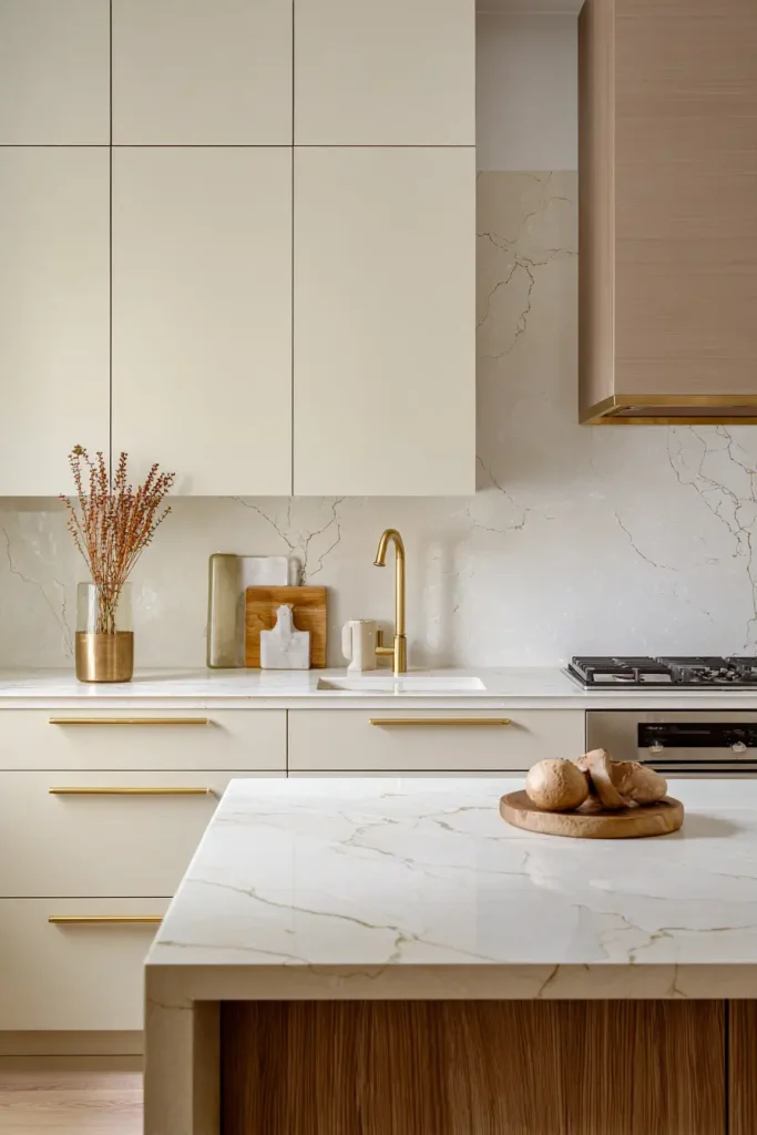
Stark white and cool gray are losing their grip on kitchen design. The replacement is warmer and creamier.
The NKBA says light brown and tan is now the number one neutral choice. 67% of pros picked it. Off whites came in second. And off whites with beige tones now lead over pure white for cabinet finishes.
Here’s a number that might surprise you. 96% of industry pros still say neutrals are dominant. But they’re not the neutrals you remember from 2019. They’re warmer and more nuanced.
Try these examples. Sherwin Williams Universal Khaki SW 6150. The company calls it “an easygoing neutral that pulls together any room.” Pantone’s Cloud Dancer is a creamy white that works as a calming foundation. Benjamin Moore Silhouette AF 655 is a rich espresso charcoal for when you want deeper neutral moments.
Pair warm neutrals with natural stone. Add some wood. And use brass hardware. That combination feels fresh but won’t age badly.
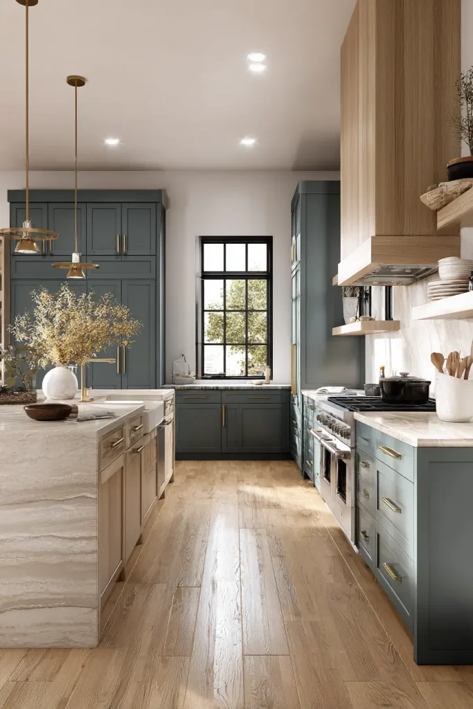
Herbal Greens – Calm, Organic, and Designer Approved
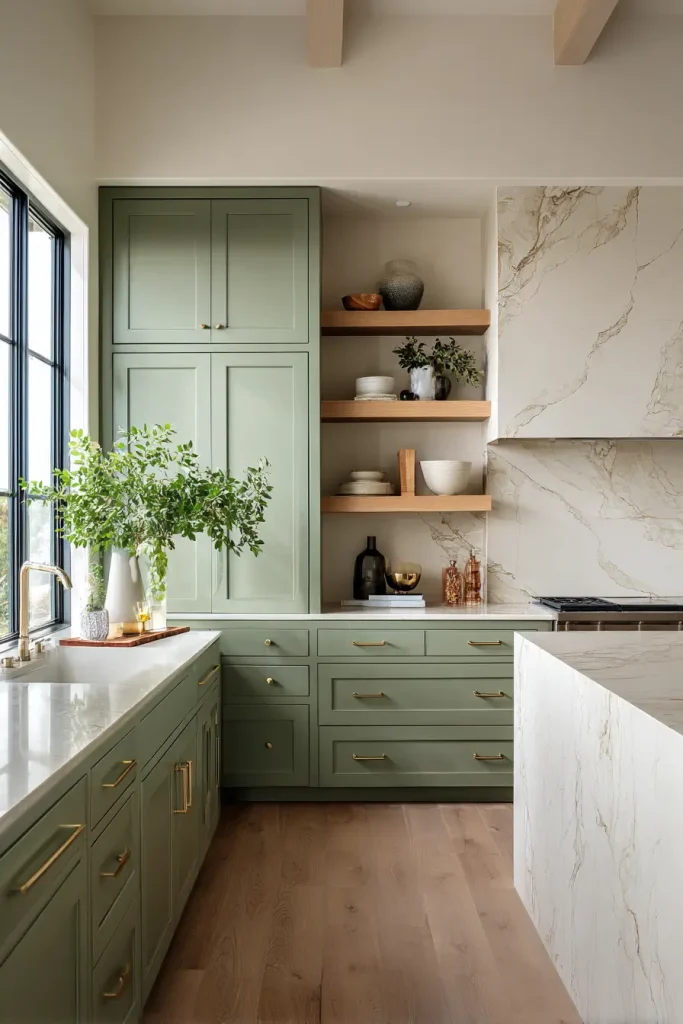
Green isn’t just popular in 2026. It’s dominant.
86% of industry pros expect green to rank highest among non neutral colors. Light green and sage hit 56%. Dark green, emerald, olive, and juniper are close behind at 51%. People want both ends of the spectrum.
The shift is interesting. Designers moved away from deep dramatic greens. Now they want lighter herbal shades like sage, olive, and moss.
MasterBrand made Lush Forest their 2026 Finish of the Year. It’s a nearly black deep green that brings sophistication. Behr picked Hidden Gem as their 2026 Color of the Year. It’s a smoky jade that balances blue and green.
Valspar offers Warm Eucalyptus. They describe it as “naturally restorative and serene.” Dunn Edwards has Midnight Garden, a deep muted green that captures a moonlit garden.
Here’s what to do. Pair herbal greens with pale stone countertops. Add warm timbers. Use brushed brass for hardware. That combination feels current and timeless at the same time.
Moody and Deep Tones – Drama Without Darkness
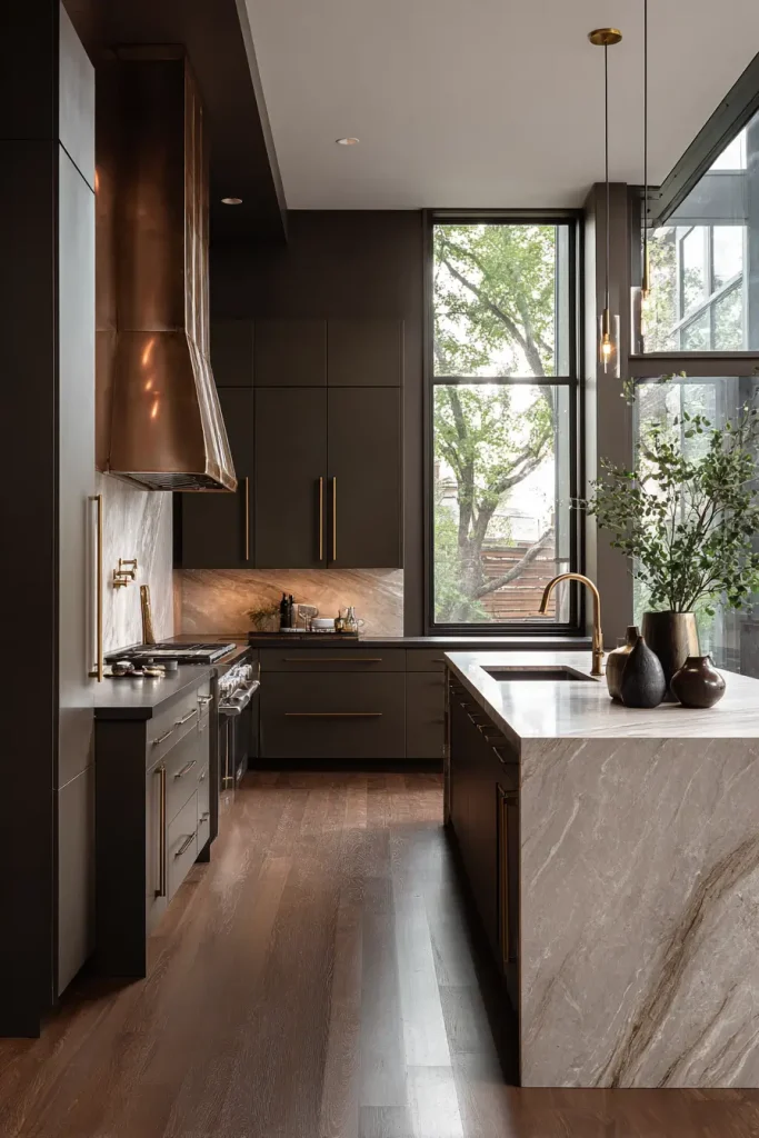
Deep colors work in 2026. But they need the right balance.
The NKBA found that 41% of respondents choose dark brown, chocolate, or mocha. Benjamin Moore Silhouette leads this deep brown trend. It’s almost black but feels warm.
Near black greens also show up. MasterBrand Lush Forest is one example. Designers say these colors look inviting when you balance them with warmth.
One designer told us, “We’ve been working with colors that nearly read as black. But when balanced with warmth, they feel inviting rather than heavy.”
How do you balance deep tones? Use light countertops. Make sure you have good natural light. And pick warm metals like brass or copper.
Try Farrow and Ball Studio Green. It’s a deep forest green that looks almost black in low light. Pair it with brass hardware and natural stone. That keeps the drama without making the room feel dark.
Blues – From Pale Powder to Moody Navy
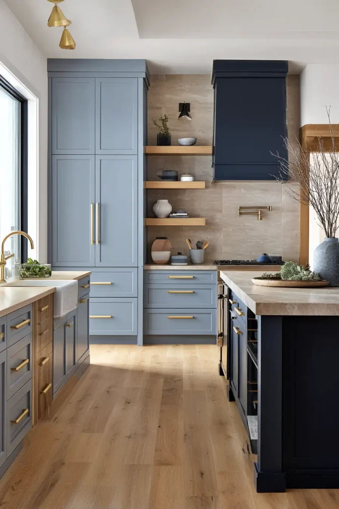
Blue is the third most popular non neutral color. 78% of pros expect it to be prominent in 2026.
Light blue and Robin’s Egg blue hit 39%. Dark blue and navy are close at 37%. Both sides of the blue spectrum are growing.
Pale blues like duck egg and powder blue are coming back. They add freshness without overwhelming the room. Slate blue is also gaining momentum. It has a moody sophistication that works well in larger kitchens.
Two tone applications work great with blue. Try navy lower cabinets with lighter uppers. Or pair navy with natural wood.
Blend light and dark blues in the same kitchen. Use pale blue on upper cabinets. Put navy on the island. Add brass accents and warm wood tones. That gives you depth without feeling busy
Earthy Browns and Reds – Warmth Rooted in Nature
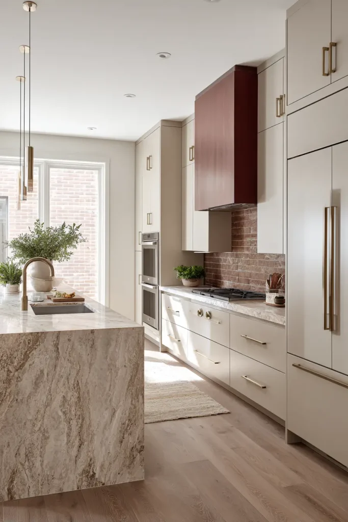
Deep reds and burgundies aren’t going away. They’re moving from small accents to larger color blocks.
Glidden makes Warm Mahogany. It’s a rich red with brown undertones. The company calls it “bold yet timeless.” That sums up the whole trend.
You’ll also see terracotta, sunbaked clay, and chestnut brown in 2026 palettes. Brick red is a breakout kitchen color this year. It offers soulful warmth that feels different from everything else.
Designers say these earthy reds work beautifully with natural wood and stone. Pair burgundy cabinetry with warm earthy neutrals. Add some velvet textiles if you want texture. Terracotta works as a sunbaked accent tone.
Try this. Use brick red on a kitchen island. Keep the perimeter cabinets in a warm neutral. Add oak flooring and brass fixtures. The red becomes a focal point without taking over.
Soft Pastels with a Muddy Twist – Unexpected Personality
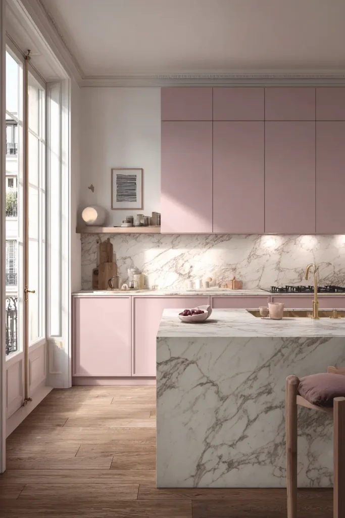
Here’s something different. Designers say clients are asking for “muddy hues that are almost a dirty version of soft pastels.”
Dusty pink and mauve show 16% interest. Light purple and lavender are at 13%. Both are climbing.
Search data backs this up. Searches for “pink kitchen” are up 112% year over year. People want color. But they don’t want it to look like a child’s room.
Farrow and Ball makes some great muddy pastels. Dead Salmon is a dusty pink brown. Hay is a muted yellow. Borrowed Light is a soft blue gray. These shades add character to older homes and new builds.
Use soft pink or blush as a base palette. Then add fuchsia or berry for focal points. Muted pastels support visual calm. They leave room for material expression like wood and stone.
Wood Tones – The Unpainted Cabinet Trend
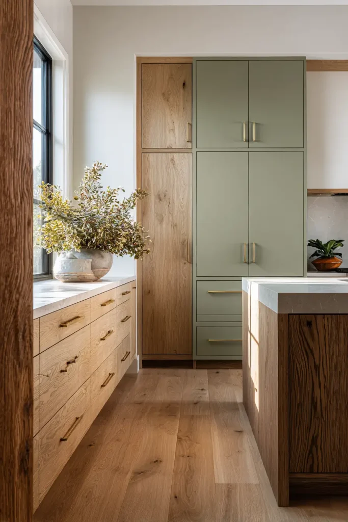
Some people don’t want paint at all. Wood tones are back in a big way.
Light toned wood stains now lead cabinet finish preferences. But mid tone wood stains are projected to overtake them by 2027. The shift is already happening.
Search volume tells the story. Searches for “oak kitchen” increased by 214% on Houzz. People want real wood. They want grain and texture.
Wood elements, especially oak, stay central to kitchen design. Natural wood brings warmth without a paint commitment. That makes it perfect for mixing with colored elements.
Some designers are wood drenching. That means using timber across floors, walls, and ceilings. But you don’t have to go that far. Try mixing wood tones with painted cabinets in two tone schemes.
Oak lowers with green uppers. Walnut island with cream perimeter. The combinations are endless.
How to Choose Your 2026 Cabinet Color
You have 7 options. Now you need to pick one.
Test large color samples. Don’t trust the small swatches. Order peel and stick samples from Samplize or paint a big piece of foam board. Check the undertones in the morning, afternoon, and evening.
Lighting changes everything. Natural light shows the true color. Artificial light can make it look yellow or blue. Test your samples under both.
Think about resale value. Warm neutrals offer timeless appeal. If you might sell in five years, stick with Universal Khaki or Cloud Dancer. Save the brick red for an island you can repaint.
Paint versus stain is another choice. Stains hide wear better. Painted fronts can show chips. If you have kids or cook a lot, stain might be smarter.
Start with a neutral base. Then add personality through islands or accent cabinets. That way you can change the bold color later without redoing the whole kitchen.
Use the Sherwin Williams ColorSnap visualizer. Try Benjamin Moore Personal Color Viewer. Both are free. Both help you see the color on your actual kitchen layout.
Two Tone Cabinet Combinations for 2026
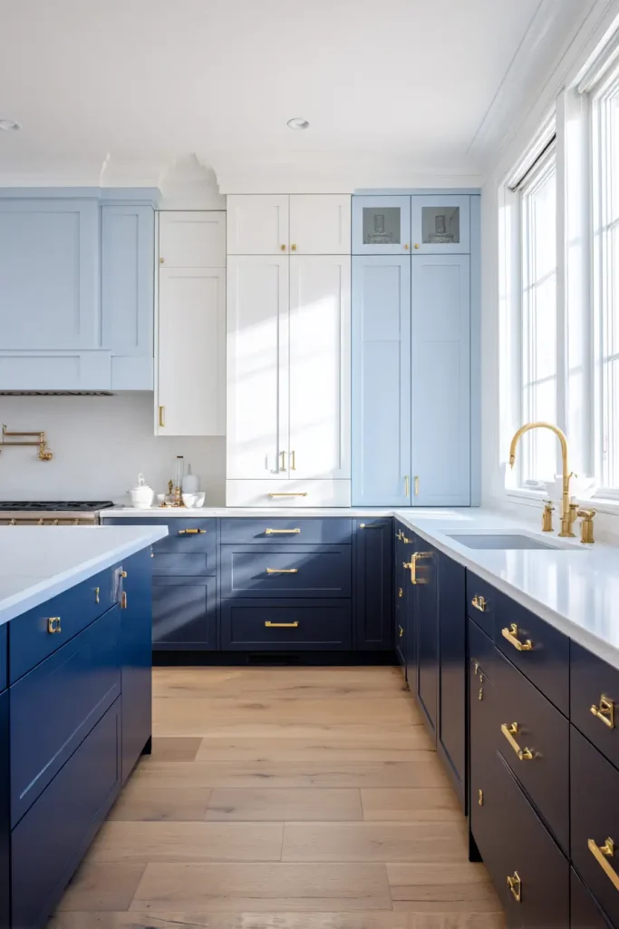
Two tone cabinetry is surging in popularity. It gives you striking contrast and a layered look.
What’s the most popular contrast? Green lowers with lighter uppers. 21% of pros picked that combination. Beige and grey lowers came in at 11%.
Here’s a designer favorite pairing. Use Universal Khaki on your perimeter cabinets. Put Silhouette on the island. That warm neutral plus deep brown combination works in almost any kitchen.
The basic rule is simple. Upper cabinets lighter. Lower cabinets darker. That grounds the space visually. Your eye rests on the darker bottom and moves up to the lighter top.
You can also blend light and dark hues. Or mix natural wood with paint. A walnut base cabinet with cream uppers gives you warmth and brightness.
Try this. Pale blue uppers. Navy lowers. Brass hardware. White quartz countertops. That’s a 2026 look that feels fresh but not weird.
Conclusion
The 2026 kitchen moves away from sterile whites and cool grays. The new direction includes warmer neutrals, nature inspired greens, moody deep tones, and unexpected muddy pastels.
The data is clear. Greens at 86%. Blues at 78%. Color is confidently returning to the heart of the home.
Which of these 7 colors speaks to your style? Save this guide for your next kitchen project. Share it with your designer. And start testing samples today.
From herbal greens to warm wood tones, these 2026 kitchen cabinet colors are reshaping modern kitchen design. Pick the one that feels right for you.

- 17 Classy Living Room Ideas for a Cozy Elegant Look - April 23, 2026
- 16 Dark Moody Living Room Ideas That Feel Rich and Warm - April 22, 2026
- 14 Elegant Bedroom Trends for 2026 You’ll Love - April 22, 2026