How to Pick a Luxury Living Room Color Palette—Using Designer-Approved Tricks
1. Luxury Begins with the Mood You Want
Before picking colors, think about how you want the room to feel. Soft and peaceful? Bold and rich? Light and airy? The mood is your anchor. Designers always start here—because the right mood leads to the right palette.
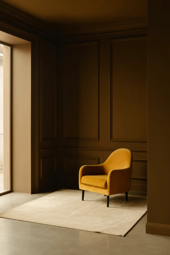
2. Choose a Base Color That Grounds the Room
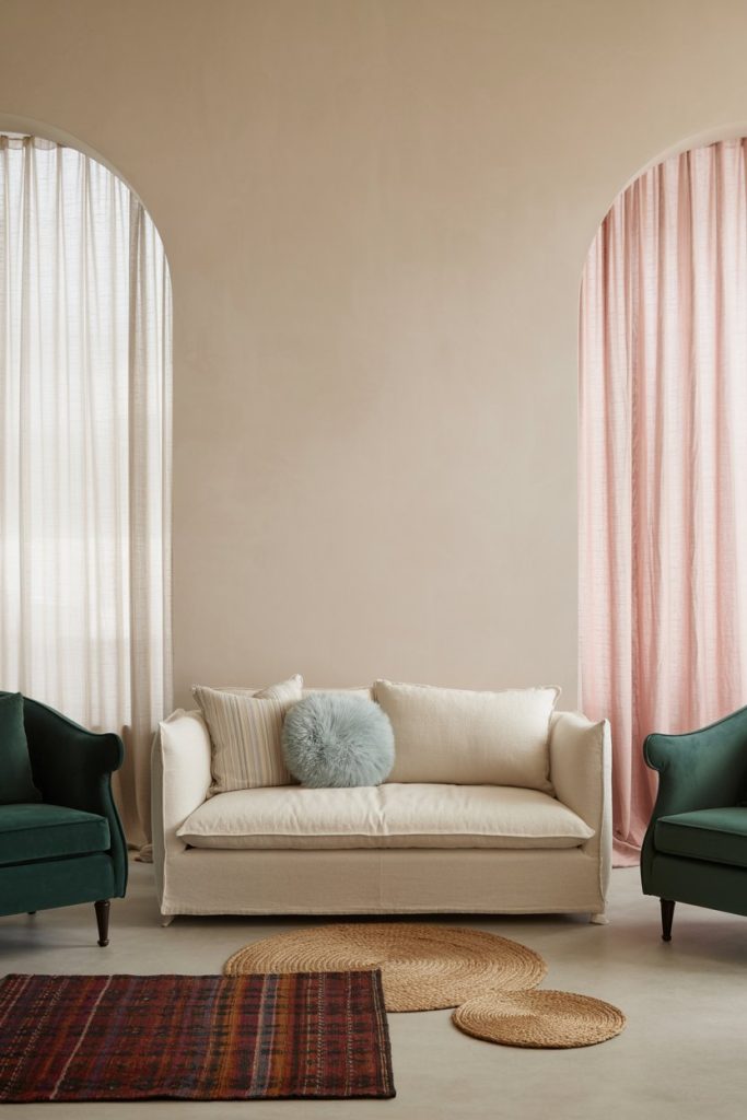
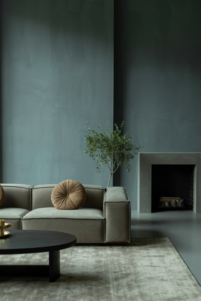
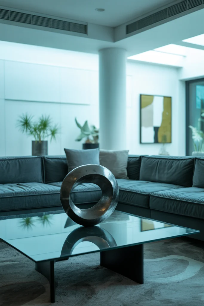
Luxury spaces always feel balanced. That starts with one solid color that grounds the whole room. Think deep gray, soft cream, warm taupe, or even soft black. This color creates structure and lets other tones shine without feeling messy.
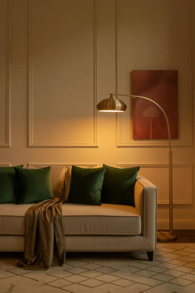
3. Add a Rich Accent Color (But Just One)
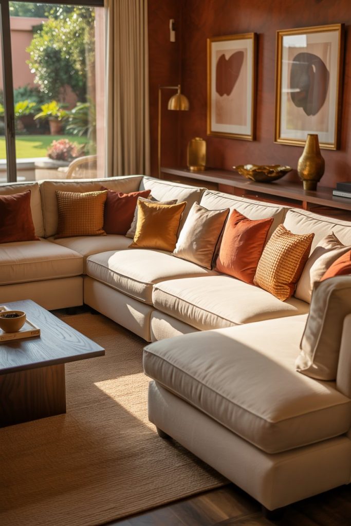
Designers use one strong color to give a room its soul. This might be emerald green, navy blue, burnt orange, or wine red. Just one bold tone is enough to add depth and drama without making things look too busy.
4. Use Neutrals to Soften and Blend
Luxury doesn’t scream—it whispers. Neutrals like ivory, stone, beige, or soft greige help blend everything together. These in-between shades are what give high-end rooms that soft, timeless look.
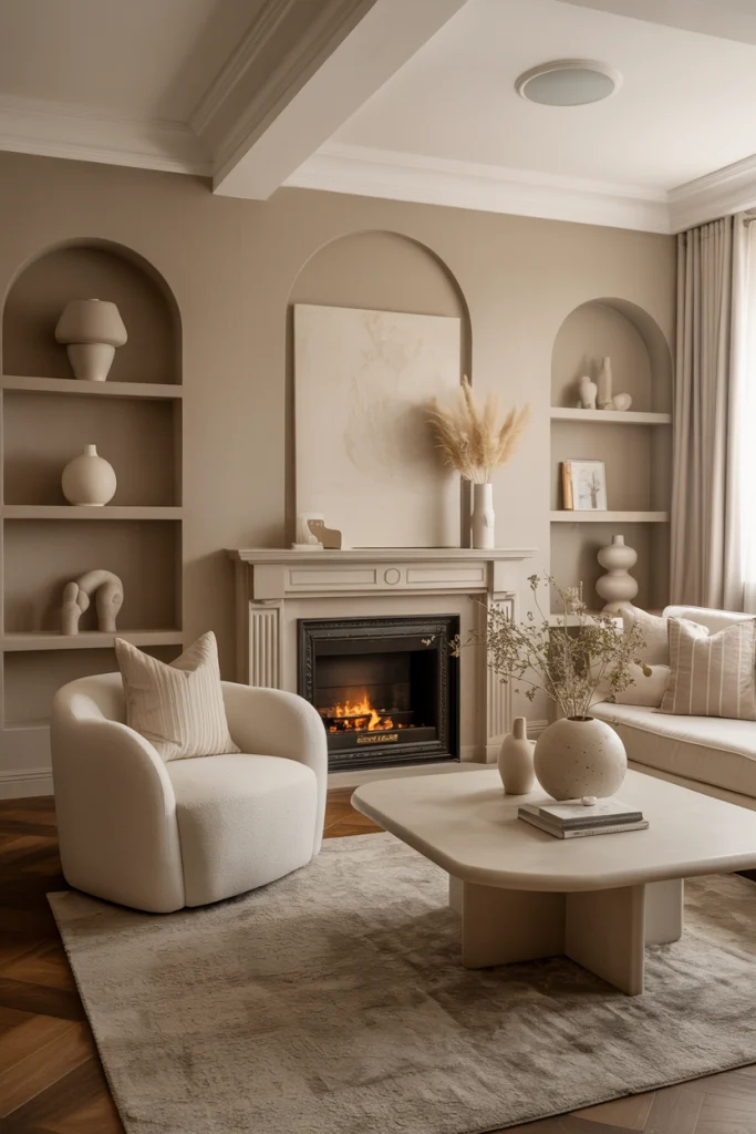
5. Stick to Three Colors, Max
Designers almost never use more than three main colors in a luxury palette. One base, one accent, and one soft neutral. More than that, and the room can feel cluttered. Keeping it tight keeps it elegant.
6. Use Texture to Let Colors Breathe
Luxury is never flat. Even if you stay within a tight palette, mixing materials like velvet, leather, wood, or linen helps your colors feel rich and layered. It’s not always about adding more color—it’s about adding more feeling.
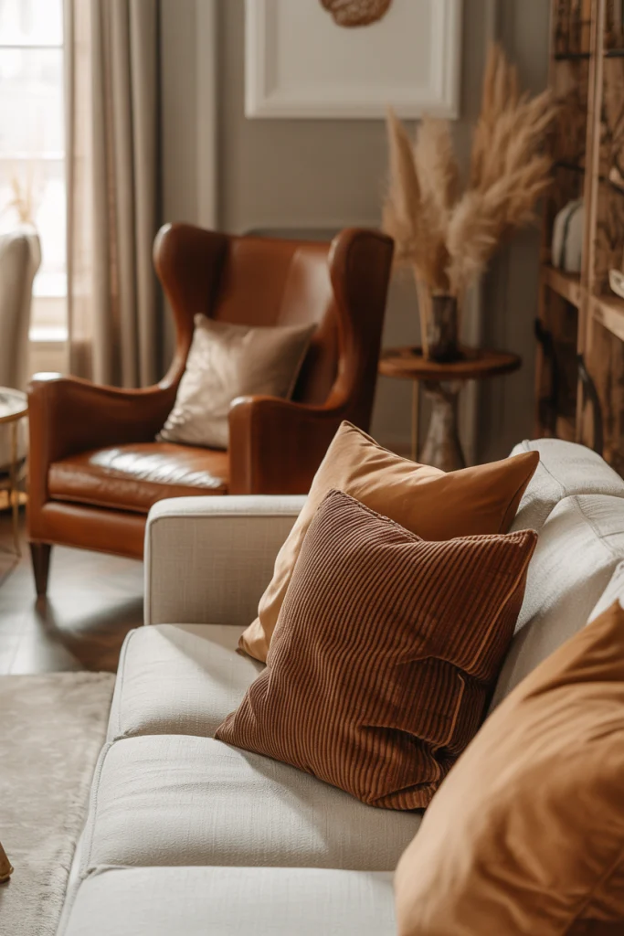
7. Warm Colors Make a Room Feel Inviting
If you want your space to feel cozy, lean into warm tones. Think warm whites, terracotta, or gold-based hues. These colors bring comfort and softness—without losing that upscale touch.
8. Cool Colors Make a Room Feel Calm
Cool shades like soft blue, slate gray, or cool green can make your living room feel peaceful and clean. Designers love these tones for modern luxury looks, especially when paired with black or metal details.
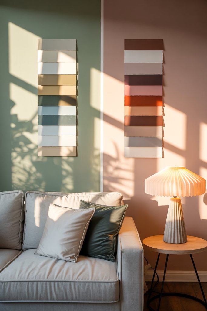
9. Play with Light to Highlight Color
Luxury colors change with lighting. Designers always test swatches in natural light and evening light. Some tones look rich in sunlight but dull at night. Always check how your color picks behave before you paint the whole wall.
10. Your Home’s Personality Matters Most
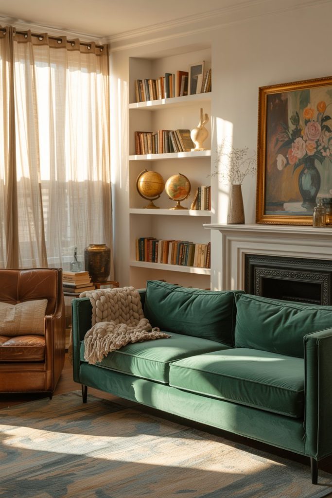
True luxury isn’t just copying a showroom. It’s about finding the right tones that match your style. Let your home speak—then let the colors follow. When your palette feels personal, the room always feels more expensive.