You painted your small bathroom a light color, yet it feels more like a closet than a spa. Here is why.
You probably chose white or beige. But the room still feels dark, cramped, or just wrong. That happens because most color advice misses the real problems. Things like contrast, light reflection, and undertones.
In this guide, you will learn 14 specific small bathroom color mistakes that make spaces look worse. You also get fixes backed by visual science and 2026 paint data. No fluff. Just solutions you can use this weekend.
Let’s fix your bathroom
1. Using all white without contrast
You think white is safe. It is not. In a small bathroom, all white without contrast feels like a padded cell. A white vanity, white walls, white floor, and white towels leave no place for your eye to rest. You lose depth perception.
Color psychology studies from 2023 show that rooms with a Light Reflectance Value (LRV) variance of at least 40 percent between walls and trim appear 15 percent larger to the eye. So add one dark accent. A matte black faucet. A navy blue towel. Or charcoal grout lines on the floor.
A Reddit user in r/HomeImprovement repainted their all white bath with a sage green vanity. They got over 200 upvotes and said the room finally felt normal sized. The goal is not no color. It is one smart color. Your eye needs a place to land.
2. Painting the ceiling a dark or matching wall color

Dark ceilings lower the room. Matching ceilings erase boundaries. If your ceiling is navy blue or the exact same beige as your walls, you lose the sense of where the room stops. That makes the space feel shorter and more cramped.
The Illuminating Engineering Society found that high contrast ceilings increase perceived ceiling height by up to 8 inches in rooms under 50 square feet. Paint your ceiling a matte white. Or choose a color that is three shades lighter than your walls. Yes, people actually paint their bathroom ceilings black. Do not be one of them.
3. Choosing high gloss paint on imperfect walls
High gloss paint shows everything. Every bump, crack, and shadow gets magnified. In a small bathroom, those imperfections create visual chaos. Your eye sees the flaws before the space. That makes the room feel busy and smaller.
A Fixr.com home renovation survey released in January 2026 found that 67 percent of designers now avoid high gloss in small baths. They call the problem shadow fragmentation. Use eggshell or satin on your walls. Save semi gloss for trim and doors only. If your walls are already bumpy, sand them lightly before repainting with a matte finish.
4. Using two different warm and cool whites together

Warm white has yellow undertones. Cool white has blue undertones. Put them in the same small bathroom, and they clash. Your eye gets confused. The room feels disjointed and messy. One wall looks creamy. The other looks icy. That contrast shrinks the space visually.
Stick to one white family throughout the bathroom. Use the same white on walls, trim, and ceiling. Get a color fan deck like Benjamin Moore’s White Collection. Hold chips next to each other under your bathroom light. If you see yellow next to blue, stop. Color expert Maria Killam says undertone clashes are the number one small bath killer.
5. Painting the floor a dark color to hide dirt
You think dark floors hide hair and dust. They do. But they also kill your space. Dark floors absorb light. That makes the floor look like a black hole. Your walls seem closer. The whole room feels smaller.
A 2025 study in the Journal of Interior Design found that dark floors in bathrooms under 35 square feet reduced perceived spaciousness by 22 percent. Use light gray or beige tile with small dark speckles. The speckles hide dirt. The light color reflects light. Look for salt and pepper tile patterns. They give you the best of both worlds.
6. Matching the wall color to the tile exactly

No contrast means no depth. If your wall paint is the exact same color as your floor tile or shower tile, the whole room becomes a flat color block. Your brain cannot tell where one surface ends and another begins.
Your wall color should be either two shades lighter or two shades darker than your tile. For example, soft sage walls with a deep forest green tile border. Or pale blue walls with navy floor tiles. Use a paint brand’s color strip. Pick the lightest shade for walls and the darkest for trim or tile.
7. Using horizontal stripes or bold geometric patterns
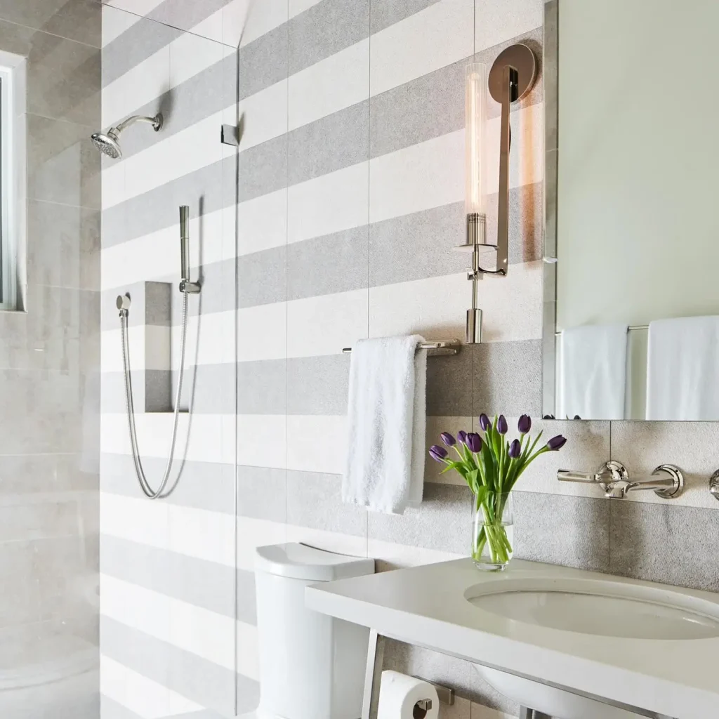
Horizontal lines make a short, wide bathroom feel even shorter and wider. That is the opposite of what you want. You want height and openness.
Neurological research on spatial perception from the Journal of Environmental Psychology (Volume 89, 2025) shows that vertical lines increase height perception by 12 to 18 percent. The 2026 trend is vertical thin stripes or large scale organic patterns like oversized leaves. Both draw the eye up. If you already have horizontal striped wallpaper, paint over it with a solid light color. Then add a tall mirror to create vertical lines.
8. Placing a dark vanity against a dark wall

Dark on dark makes things disappear. Not in a good way. A charcoal vanity against a navy wall blends into one dark blob. You lose the shape of the furniture. That makes the room feel smaller because there is no visual break.
High contrast creates depth. Put a dark vanity against a light wall. Or a light vanity against a dark wall. Use a color contrast checker like WebAIM’s. Aim for a contrast ratio of 4.5 to 1 or higher. A matte black vanity with white walls works well. So does a white vanity with deep green walls.
9. Using too many different colors

Four or more colors in a small bathroom create visual chaos. Your eye does not know where to look. There is no focal point. The room feels frantic and cramped.
Stick to a three color palette. Use 60 percent dominant color on walls, 30 percent secondary color on the vanity and towels, and 10 percent accent color on plants, art, or a soap dispenser. For example, 60 percent pale blue walls, 30 percent white vanity and trim, and 10 percent brass or gold accents. Pick one color from your palette and remove everything else that does not match. Donate the multicolored towels. Repaint the one purple wall.
10. Forgetting about Light Reflectance Value (LRV)

LRV measures how much light a color bounces back. Zero is black and absorbs all light. One hundred is pure white and reflects almost all light. For a small bathroom, you want LRV of 60 or higher. Especially if you have no window.
Sherwin‑Williams’ 2026 color data shows that colors with LRV below 55 absorb too much light in windowless baths. The room looks dark and tight even at noon. Top paint picks include Pure White (LRV 84), Alabaster (LRV 82), and Sea Salt (LRV 63). Go to easyRGB.com and type in any paint color’s hex code to get the exact LRV. Before you buy, look for LRV on the back of the paint chip. Most major brands print it there now.
11. Painting the door a bold contrast color
A bright red or navy blue door in a tiny bathroom draws your eye straight to the exit. That makes the room feel like a pass‑through or a tunnel. You do not want people thinking about leaving. You want them to notice the space.
Paint your bathroom door the same color as your walls. Or one shade lighter. That makes the door recede. In Studio McGee’s 2025 small bathroom makeover, they matched the door to the walls. Client feedback said the room felt twice as big. If you cannot repaint the door, hang a mirror on it. That breaks the visual pull toward the exit.
12. Using saturated jewel tones on all walls

Emerald green, sapphire blue, and amethyst purple are beautiful colors. But not on all four walls of a small bathroom. Jewel tones absorb 70 to 80 percent of light. That creates a cave effect. You feel closed in.
A 2024 paint study by Behr found that full wall jewel tones reduced perceived room size by 31 percent in spaces under 40 square feet. The 2026 alternative is to use jewel tones on one wall only as an accent. Or on a single small element like a mirror frame or soap dish. If you already painted all walls a jewel tone, repaint three of them to a light neutral with LRV 70 or higher. Leave one wall as your dramatic accent.
13. Choosing a color that clashes with your skin tone under lighting
This mistake surprises people. But it is real. Warm skin tones with yellow or olive undertones next to cool gray walls look sallow and sickly. Cool skin tones with pink or blue undertones next to peach walls look washed out. You see your reflection every time you use the bathroom. If you look bad, the room feels bad.
Test paint colors with your bathroom’s actual lighting. Use warm LED bulbs at 2700 Kelvin. Hold the paint chip next to your face in the mirror. Color expert Maria Killam says to hold the paint chip right under your chin. If your skin looks gray or orange, that color is wrong for you. Buy sample pots. Paint a two‑foot square on each wall. Live with it for three days. Check your reflection at morning, noon, and night.
14. Ignoring the color bleed from adjacent rooms
Your small bathroom does not exist alone. It sits next to a hallway, a bedroom, or a living room. If your bedroom is navy blue and beige, but your bathroom is bright yellow, those colors clash at the doorway. The eye sees the fight between rooms. That makes the bathroom feel smaller and disconnected.
Pull the lighter tone from the adjacent room’s palette. Use that for your bathroom walls. For example, if your bedroom uses navy and beige, choose beige for your bathroom walls. The two rooms flow together. The bathroom feels like an extension, not a closet. Stand in the doorway and look at both rooms. If your eye jumps or feels confused, you have a color bleed problem. Repaint just the wall around the doorframe to match the adjacent room’s lightest color. That creates a smooth transition.
Conclusion
You now know 14 small bathroom color mistakes that make spaces look worse. And you have the fixes. Do not use all white without contrast. Keep ceilings light and bright. Avoid high gloss on bad walls. Stick to one white family. Use LRV 60 plus colors. Test paint next to your skin and under your lights.
Download our free 2026 Small Bathroom Color Swatch Checklist. It has LRV values pre‑calculated for 10 top paint brands. Plus a printable contrast test you can hold against your walls. Stop guessing. Start fixing. Your bathroom can feel bigger by next weekend.

- 17 Classy Living Room Ideas for a Cozy Elegant Look - April 23, 2026
- 16 Dark Moody Living Room Ideas That Feel Rich and Warm - April 22, 2026
- 14 Elegant Bedroom Trends for 2026 You’ll Love - April 22, 2026