Introduction
Your living room feels off but you can’t figure out why.
Maybe it looks dull. Too dark. Too cold. Or just outdated. You move pillows around. You buy a new rug. You switch lamps. It still feels wrong. And that is frustrating because this is the room where you relax, host friends, and spend time with family.
Here is the truth. Furniture helps. Decor helps. But paint is what truly changes a space. Wall color controls light. It shifts mood. It makes a room feel bigger or smaller in seconds.
In this guide, you will find 18 living room paint color ideas that actually work in real homes. You will learn how to pick the best paint colors for living room lighting, how to build balanced living room color schemes, and which modern living room colors are popular right now without feeling trendy for just two months. By the end, you will feel clear about what works in your space and why.
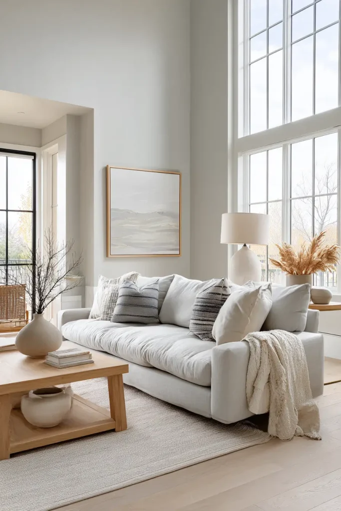
1. Warm White for a Soft, Timeless Living Room
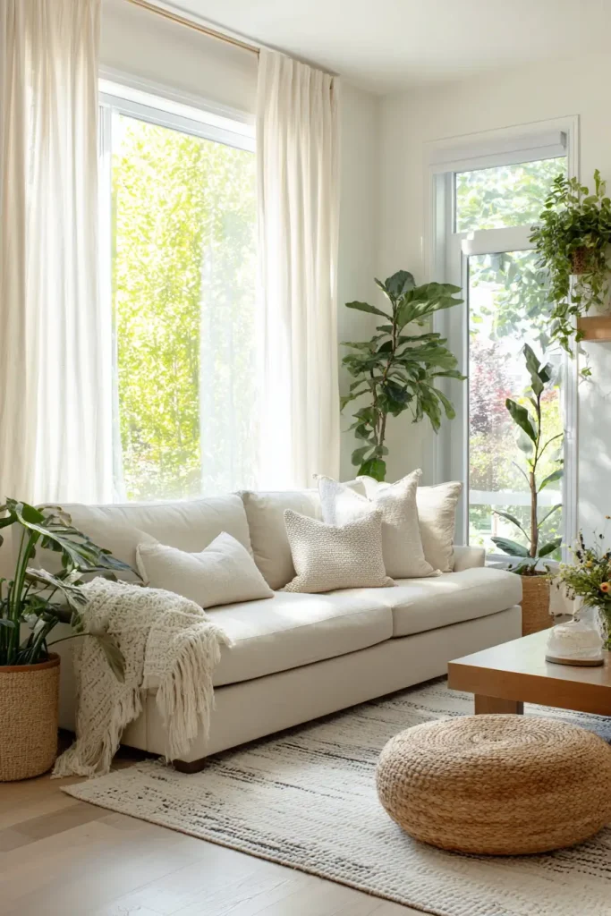
Warm white fixes a room that feels cold or flat. It adds light without feeling harsh.
Bright white can look sharp. It can feel sterile. Warm white feels calm. It has soft undertones like cream, beige, or a hint of yellow. That small shift makes a big difference. Your walls look smooth instead of stark.
This works in small rooms because it reflects light. It also works in large rooms because it keeps them from feeling empty. That is why designers often call warm white one of the best paint colors for living room spaces of any size.
Benjamin Moore “White Dove” is a popular choice. Sherwin-Williams “Alabaster” is another favorite. Both have gentle warmth without looking yellow. In 2025 trend reports, warm neutrals continued to rise because people want comfort at home.
If you want safe but beautiful living room paint color ideas, start here. Pair warm white with wood floors, linen curtains, and soft beige furniture for a clean and modern look.
2. Greige for a Balanced Modern Look
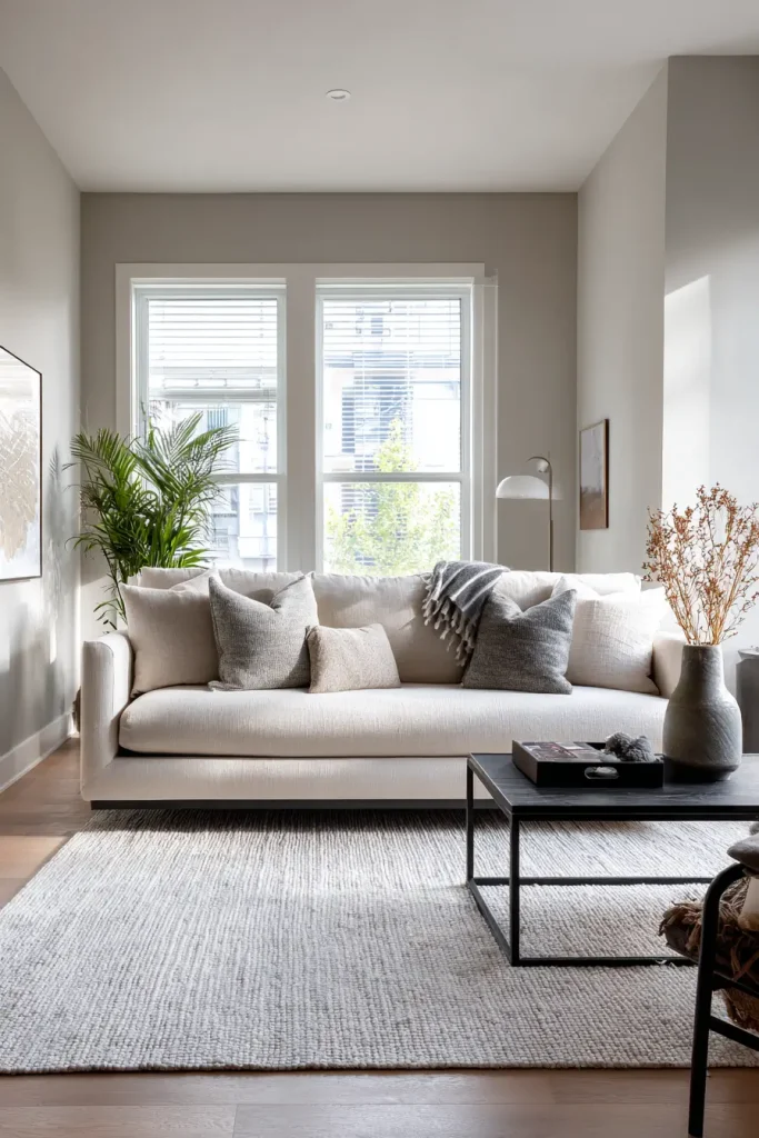
Greige solves a common problem. You like gray. You like beige. You cannot choose.
Greige blends both. It gives you the clean look of gray and the warmth of beige in one color. That balance makes it one of the most flexible living room color schemes.
This shade feels safe. But it is not boring. It changes with light during the day. In north-facing rooms, which often feel cool, greige adds needed warmth. In bright rooms, it stays soft and steady.
“Revere Pewter” is a well-known greige. Many home stagers use it because it appeals to buyers. It helps furniture stand out. It makes rooms look updated without looking trendy.
If you plan to sell one day, greige is smart. If you want a calm space that works with almost any sofa, it is also smart. Add black accents for contrast or warm wood tones for comfort. That flexibility is why greige remains a top pick.
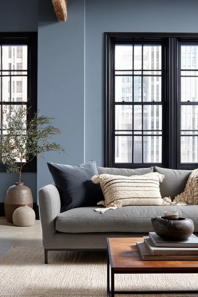
3. Deep Navy for Dramatic Elegance
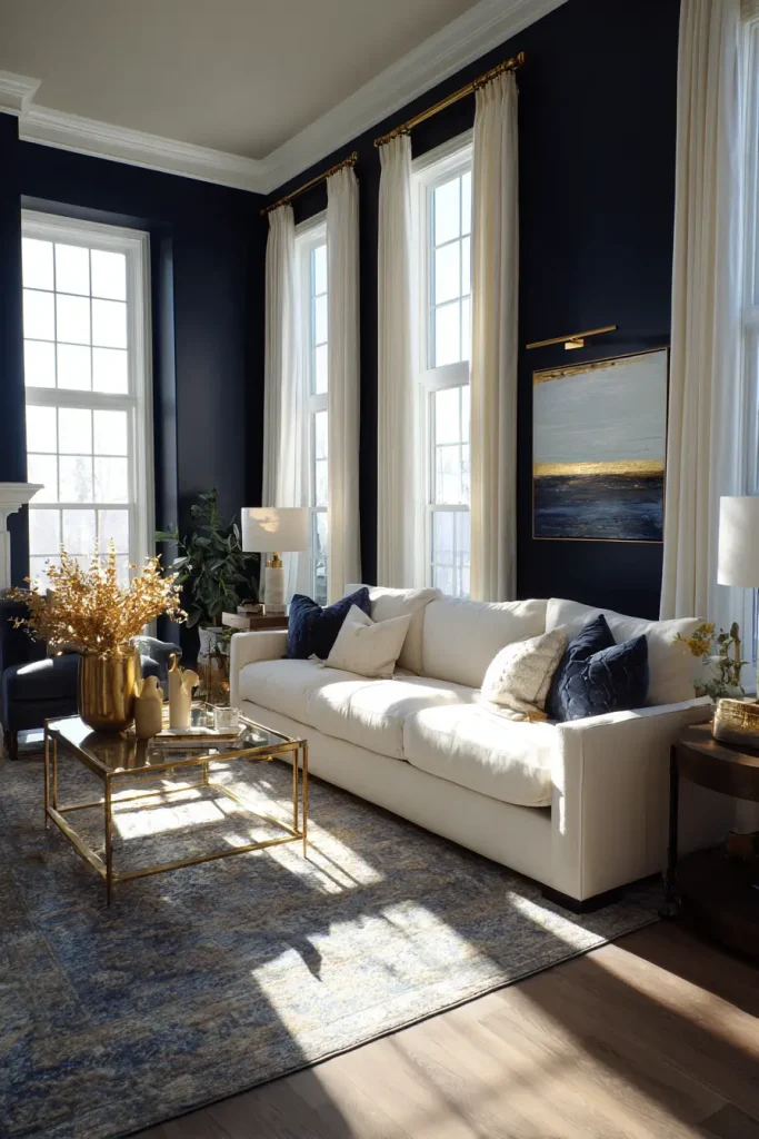
Sometimes your living room needs contrast. It needs depth. That is where deep navy shines.
Navy creates drama without feeling loud. It makes white trim pop. It frames windows beautifully. In larger rooms, it adds coziness so the space does not feel empty.
Dark blues are among the top five most searched interior colors on Pinterest in recent reports. People love bold walls again. But navy still feels classic.
Pair navy with brass or gold accents. Add cream sofas or light wood floors to keep balance. If your room gets plenty of light, navy will look rich instead of heavy.
This shade works well in modern living room colors because it feels clean and strong. If painting the whole room feels scary, try one accent wall first. You may love it more than you expect.
4. Earthy Sage Green for Calm Energy
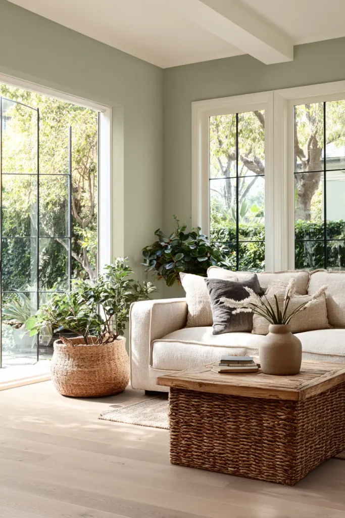
If your living room feels busy, sage green can calm it down.
Sage is soft. It connects your space to nature. This fits with the biophilic design trend, which focuses on bringing natural tones indoors. And here is why that matters. Natural colors help people relax.
Sage works beautifully with wood floors and woven textures. It pairs well with cream sofas and simple decor. In rooms with good natural light, it feels fresh and airy.
Shades like “Clary Sage” or “October Mist” have gentle gray undertones. They avoid looking too bright. That makes them easier to live with long term.
If you want color but do not want bold drama, sage is a smart middle ground. It adds personality while staying peaceful.
5. Charcoal Gray for a Luxe Feel
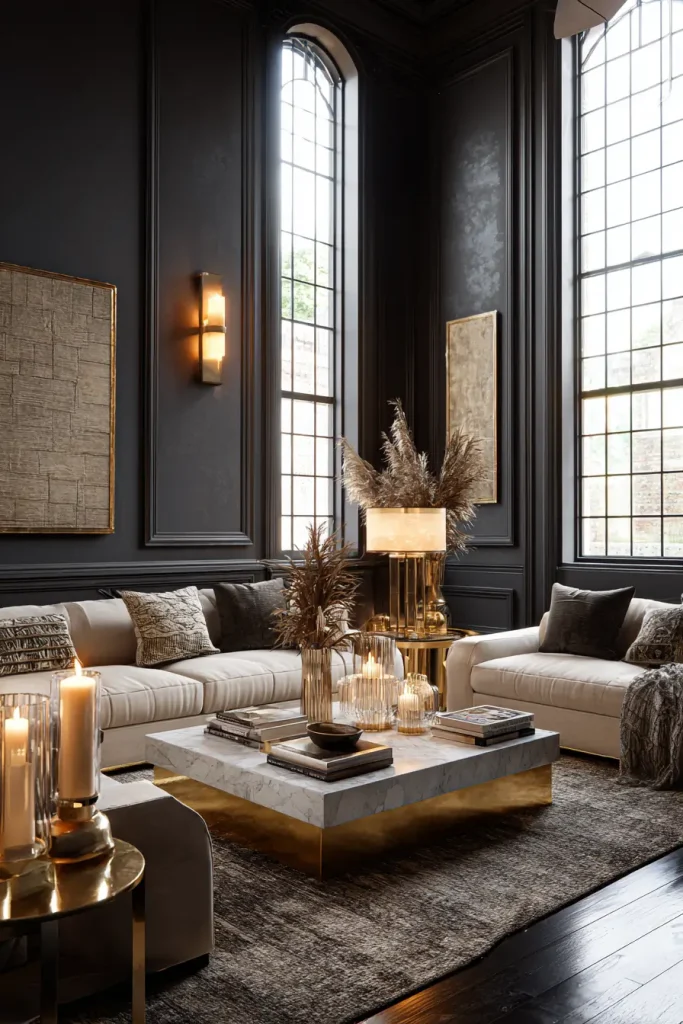
Charcoal gray adds depth without going full black.
Black can feel harsh. Charcoal feels softer. It creates a cozy mood, especially in larger living rooms with high ceilings.
You can paint all four walls for drama. Or paint one accent wall to ground the space. If your furniture is light, charcoal makes it stand out. If your decor is metallic, it shines more against a dark wall.
This color works best in rooms with strong lighting. Natural light helps prevent it from feeling heavy. Add warm lamps to balance it at night.
Charcoal gray feels modern and bold. But it still stays neutral enough to work with many styles.
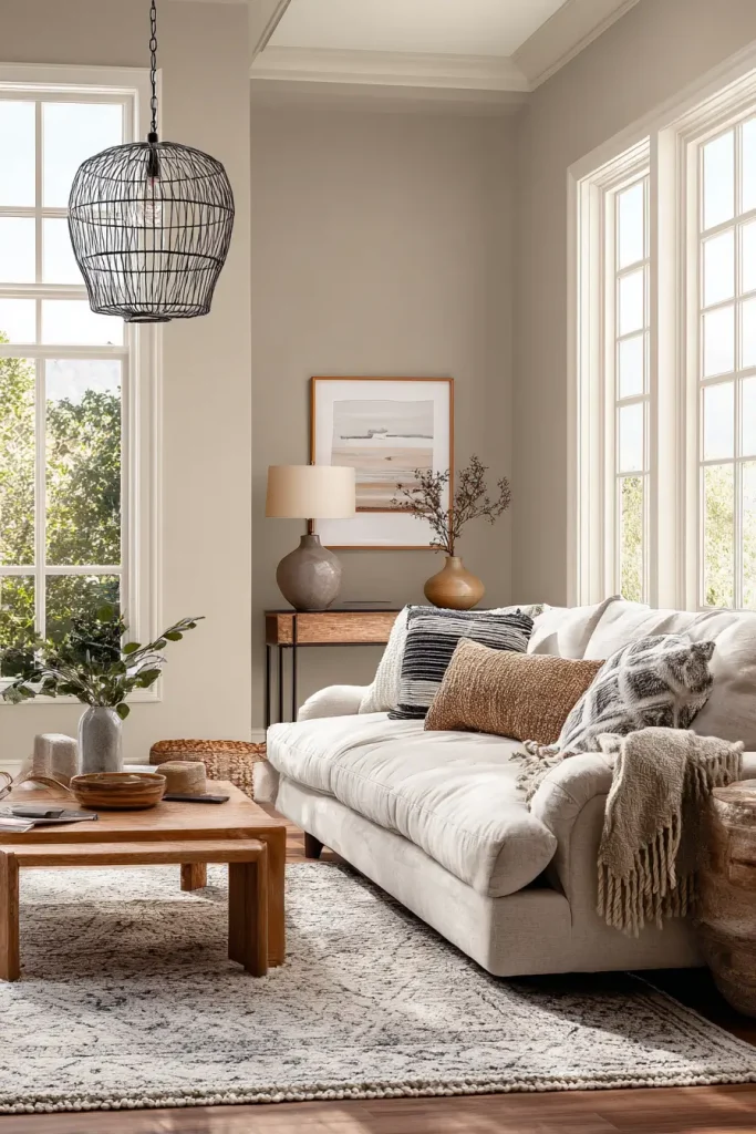
6. Soft Beige for a Cozy Neutral Base
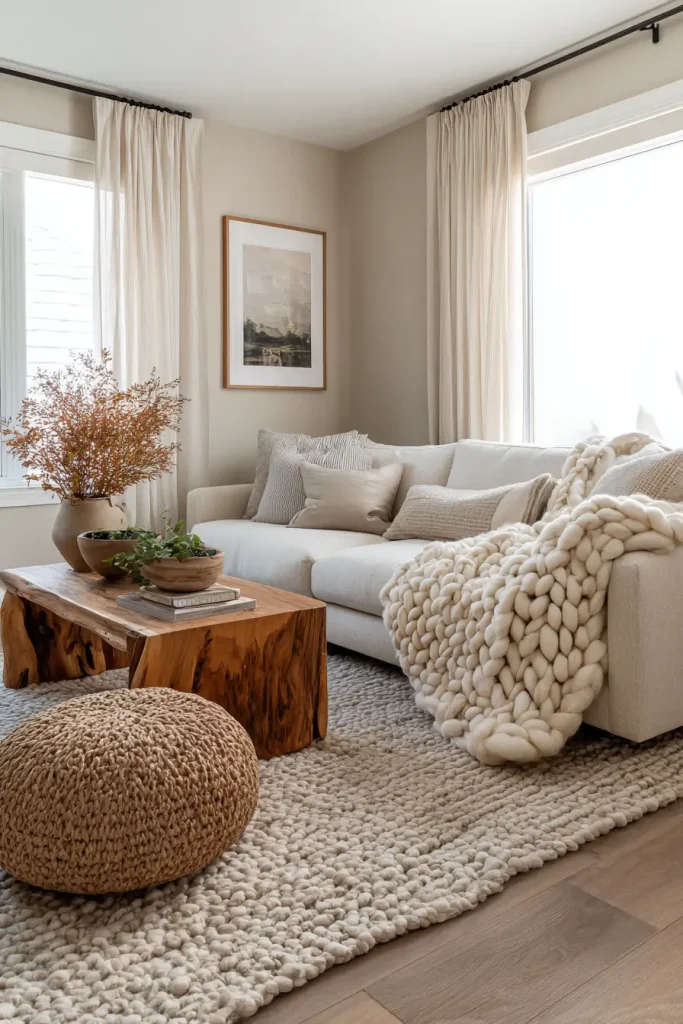
Beige is back. And it feels better than before.
Old beige looked flat. New beige has warmth and depth. It works well with modern furniture because it softens clean lines.
If your living room feels cold, beige fixes that fast. It makes the space feel lived-in and welcoming. It also works well for layering textures like chunky throws, woven rugs, and wood tables.
Soft beige is easy to decorate around. It supports many living room color schemes, from earthy tones to black and white.
Choose a beige with a hint of warmth. Avoid anything too yellow. Test samples on your wall before deciding.
7. Moody Olive for Depth and Warmth
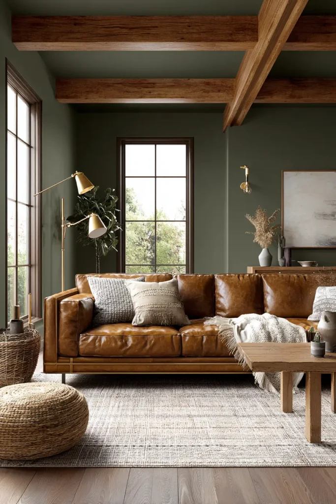
Olive green feels rich and grounded.
Warm greens are trending because they feel natural and steady. Olive adds depth without feeling too dark. It pairs beautifully with leather sofas and brass lamps.
This shade works well in rooms with medium to bright light. In low light, it becomes deeper and moodier.
If your style leans rustic, organic, or modern farmhouse, olive fits easily. Add cream or tan decor to keep it balanced.
Olive feels bold but still grown-up. That balance makes it easy to live with.
8. Dusty Blue for Relaxed Comfort
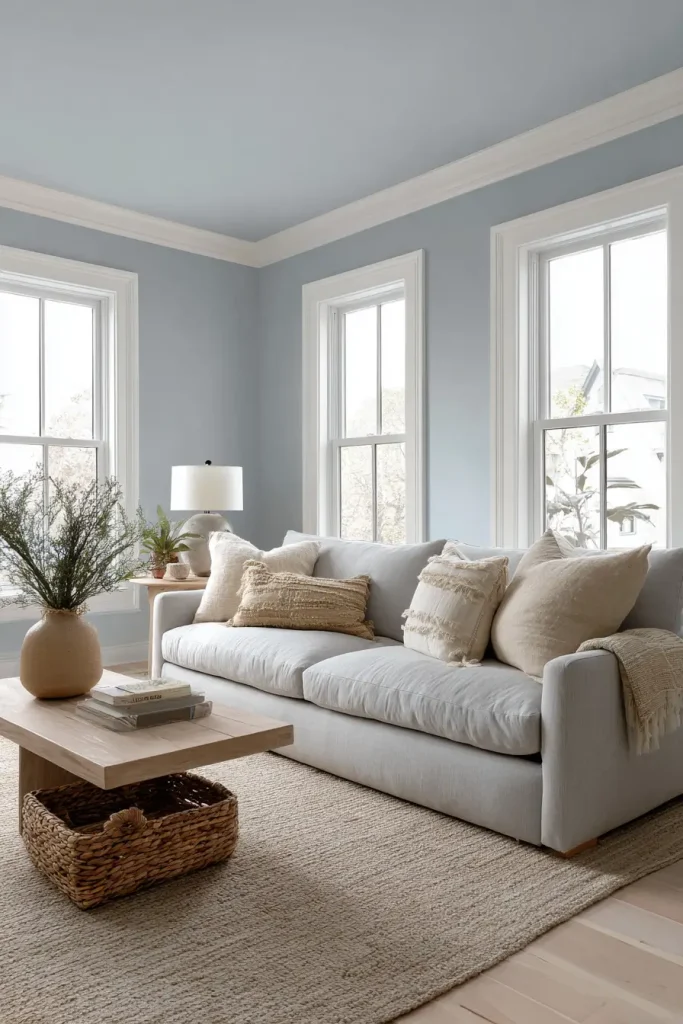
Dusty blue feels calm right away.
It works well in cottage or coastal spaces. But it also fits modern homes when paired with clean furniture.
In small rooms, dusty blue can actually make walls feel farther away. The cool tone adds airiness. Choose a muted version to avoid looking too bright.
Pair it with white trim and light wood for a relaxed look. Add soft gray or beige decor for balance.
If your goal is comfort, dusty blue is a strong choice.
9. Terracotta for Warm Personality
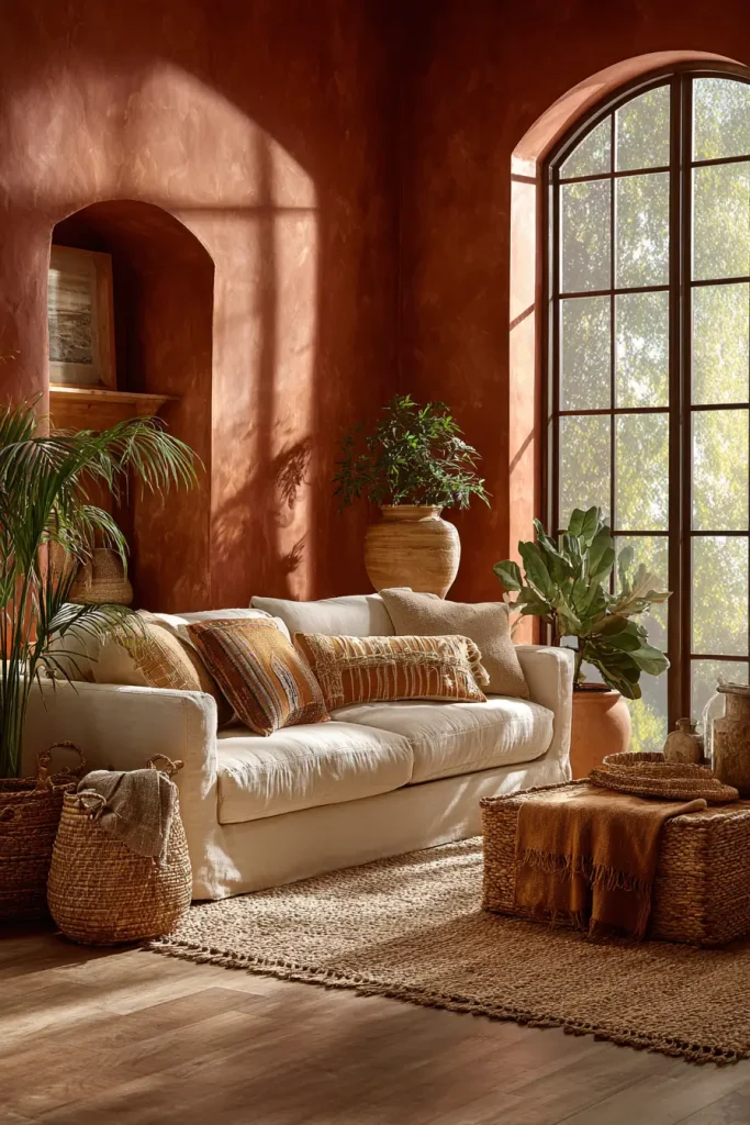
Terracotta brings warmth fast.
It feels earthy and natural. This shade fits southwestern and organic modern styles very well.
If your living room gets lots of sunlight, terracotta glows beautifully. In low light, it becomes deeper and cozy.
Pair it with cream furniture and woven textures. Add plants to enhance the natural feel.
Terracotta is bold. But in the right space, it feels inviting and full of life.
10. Creamy Taupe for Subtle Sophistication
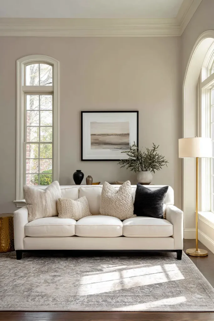
Taupe sits between gray and beige.
It feels softer than gray and cooler than beige. That balance makes it a great transitional color if you are unsure what direction to go.
Creamy taupe works well in both traditional and modern homes. It also pairs easily with wood, black, and brushed gold finishes.
If your living room feels disconnected, taupe can unify everything.
11. Soft Blush for a Gentle Glow
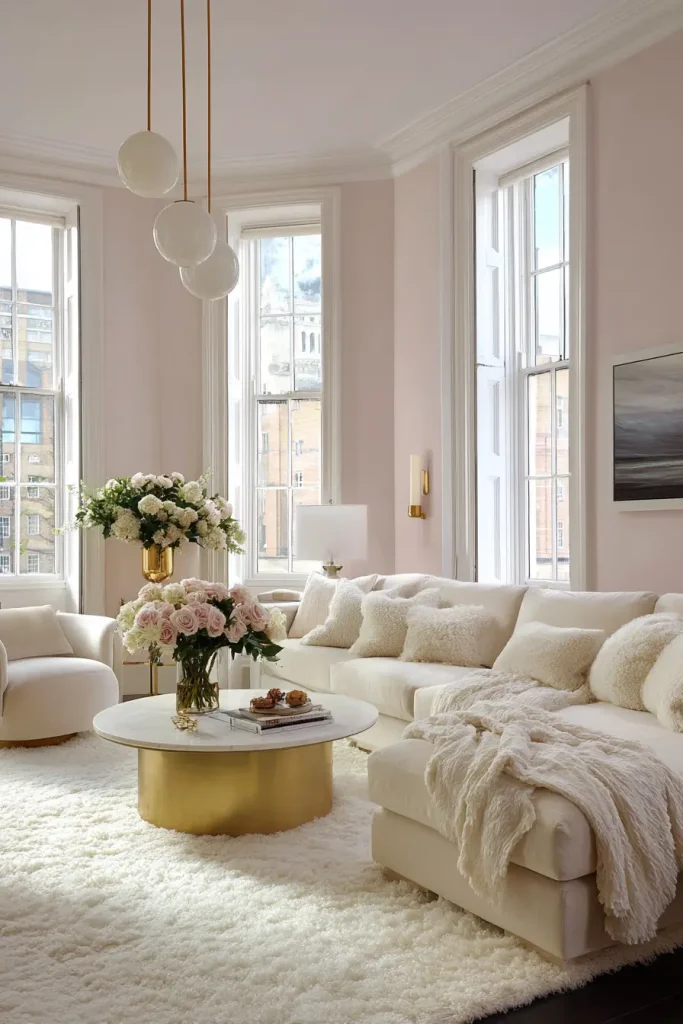
Blush is softer than you think.
When muted, it reads almost like a warm neutral. It reflects light in a flattering way, which helps darker rooms feel brighter.
Soft blush pairs well with gray, cream, and gold accents. It adds warmth without overpowering the space.
If you want something different but still calm, blush is worth testing.
12. Warm Mushroom for 2026 Trend Appeal
Mushroom tones mix beige, gray, and a hint of brown.
They feel fresh but grounded. Designers are using them more in 2026 because they work with many styles.
Warm mushroom looks elegant without trying too hard. It feels cozy in both small and large rooms.
Pair it with natural fabrics and warm lighting for best results.
13. Slate Blue for Contemporary Calm
Slate blue blends blue and gray.
It feels calm but modern. It pairs beautifully with black window frames and metal accents.
In bright rooms, it feels soft. In dim rooms, it becomes moodier.
Slate blue works well if you want color but still want a clean look.
14. Rich Chocolate Brown for Cozy Drama
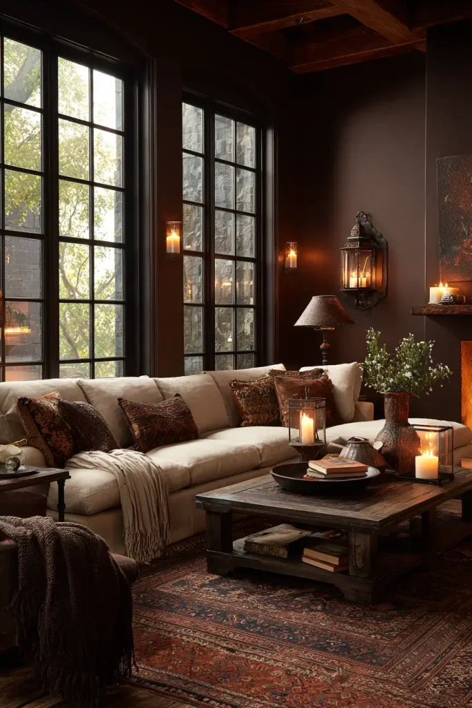
Dark brown is coming back.
Chocolate brown feels warm and strong. It works well with cream furniture and soft lighting.
In 2026, deeper earth tones are gaining popularity because people want comfort at home.
Use brown in larger rooms or on one feature wall for best results.
15. Pale Gray for a Clean Look
Pale gray feels simple and light.
It fits minimalist homes and Scandinavian styles. It keeps the focus on furniture and decor.
Choose a gray with warm undertones to avoid a cold feel.
If you like a clean, open look, pale gray is reliable.
16. Muted Teal for Bold Personality
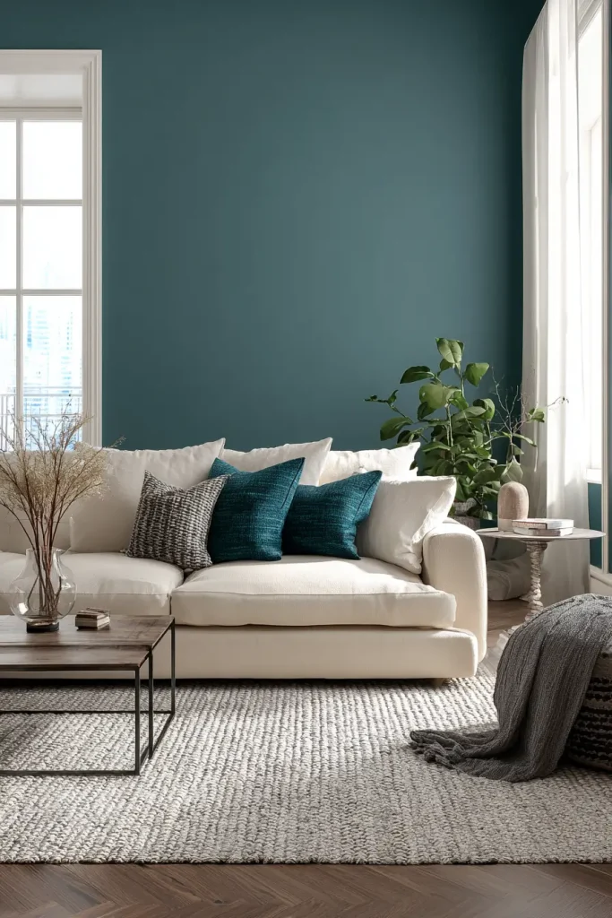
Muted teal adds personality fast.
It works well as an accent wall. It pairs nicely with statement sofas in cream or tan.
If your living room feels flat, teal brings life without going too bright.
Balance it with neutral decor.
17. Soft Lavender Gray for Unexpected Elegance
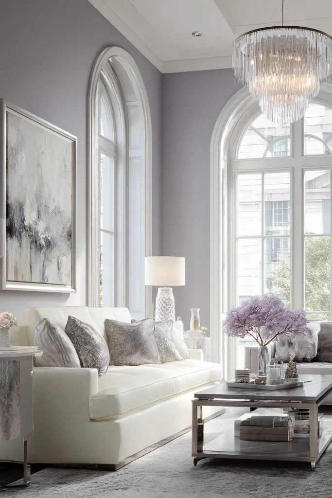
Lavender gray sounds bold. But it is subtle.
The slight purple undertone adds depth, especially in natural light. It shifts gently throughout the day.
This shade works well in creative or artistic spaces. Pair it with silver or soft white accents.
If you want something different but refined, this is a strong option.
18. Classic Black Accent for High Contrast
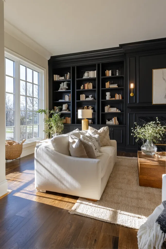
Black works best in small doses.
A feature wall can add instant drama. But painting every wall black may feel heavy.
Use black behind a fireplace or built-in shelves. Pair it with light furniture and good lighting.
Black creates contrast. And contrast makes a room feel designed on purpose.
Conclusion
You have now seen 18 living room paint color ideas that solve real problems. Some add light. Some add warmth. Some add bold contrast. The right one depends on your room size, your lighting, and how you want to feel at home.
Before you commit, test samples on your walls. Watch how they change during the day. Lighting matters more than you think.
Save this guide for later. Share it with someone redecorating. And try a sample this week. The right color can completely shift your space. These living room paint color ideas give you a clear place to start.

- 17 Classy Living Room Ideas for a Cozy Elegant Look - April 23, 2026
- 16 Dark Moody Living Room Ideas That Feel Rich and Warm - April 22, 2026
- 14 Elegant Bedroom Trends for 2026 You’ll Love - April 22, 2026

